By: Emma Rose van der Hoek, Game Artist
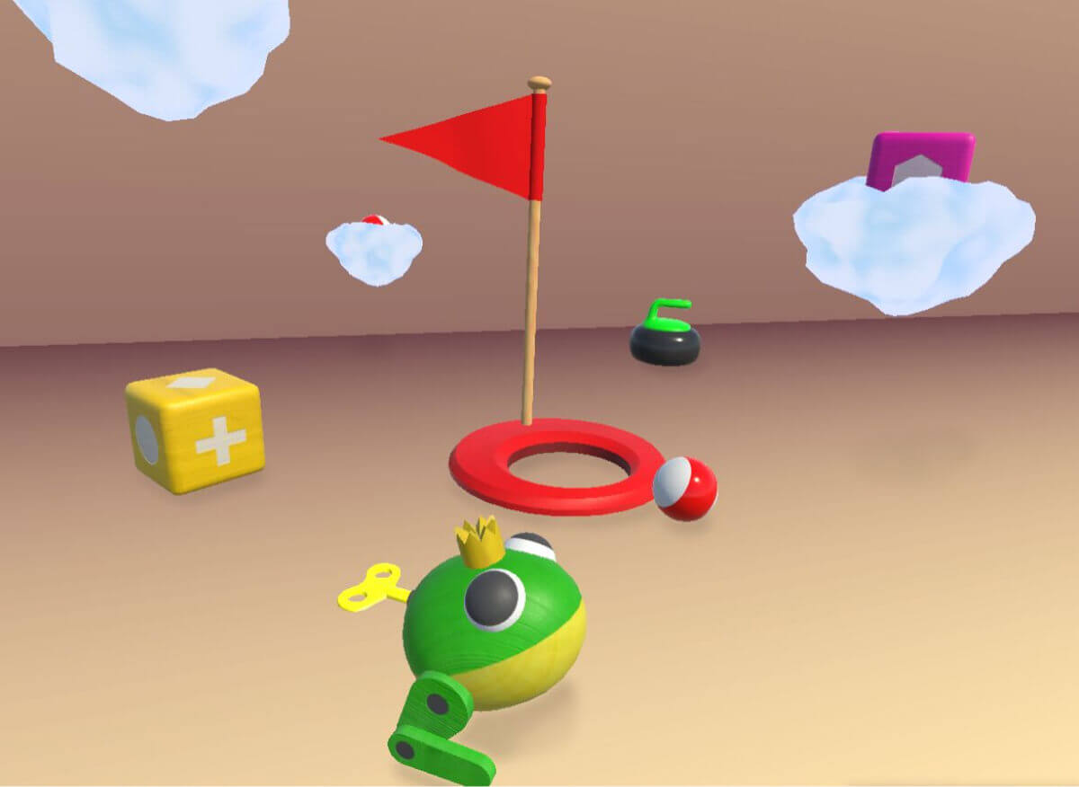
As a Game Artist, my job is to make our products beautiful, but that involves a lot more than just “beautiful.” This is because it is important that it also fits nicely within the game design, matches the target audience, can be used functionally, etc. A good example is Table Ball. In this case, the game was already made and I was asked to make it more beautiful. So for Table Ball, design, mechanics and objects already existed.
The first goal in this was to create more cohesion between objects such as a cage, curling puck and block. This cohesion is created through one overarching theme; toys. However, in order not to make it too childish, the focus is more on old-fashioned, quality toys, especially made of wood. This way, an older player can also relate to the theme. Another goal was to help convey the expected interaction as much as possible. Ideally, the player sees an object and immediately understands how to use that object. The goal is actually to require as little explanation as possible. To make this happen, object recognition and legibility are key.
Recognizability
Recognizability can greatly help a game feel intuitive and clear. For example, the hole where the objects have to go in has become a mini-golf hole. A mini golf hole will elicit recognition from most people, to manage to get objects (mainly balls), into the hole. Because this association is evoked in the player, the gameplay feels logical and intuitive. In doing so, shape can also help provoke certain movements.
With the curling puck, the idea is for the player to grab the handle with the whole hand. The handle of this puck has indentations for the fingers to visually convey this. This type of indentation is more common in objects where grip is expected, such as a door handle or a bicycle handle, for example. The idea is that the player recognizes these coves and understands what to do.
Readability
The legibility of objects helps with player clarity and overview. This is about how easily visible elements are, as well as conveying interaction and movement. For example, in 3D, it can sometimes be difficult to tell if the block is actually turning after a move and not just moving forward. To make this more readable, I gave each side of the block a different symbol. This way you can see the symbol change as the block rotates and the movement becomes clearer.
Another form of legibility is drawing attention to certain elements of an object. Here it is important to consider where to draw attention and why. With the frog, the interaction is on the winding key, it must be turned. So it is important that the player sees not just a frog, but the key.
To help with this, there is a flashing effect on the frog’s key. This helps the player see that this is the most important element. This flashing is also on other elements; it is important to remain consistent in this. Flashing is applied only to objects that require a grip or pinch rather than pushing or tapping. The expectation here is to create a recognition between blinking and grasping/pinning that makes clear what is expected of the player.
Of course, there is much more to intuiting objects. For example, I have also been working a lot with colors, feedback, animations, scale, etc. This is an example of some of the principles I am constantly working on as a game artist at HoloMoves.


